Its all a matter of Semantic(s)
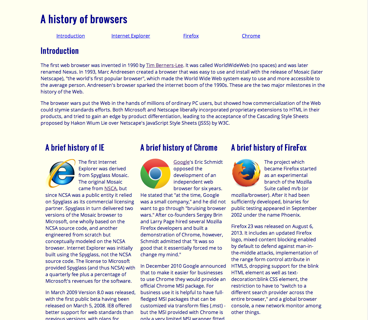
06 Oct 2016The past two weeks have been focused on learning user interface and more recently frameworks for them. Having already take a few web design classes many years in the past I found myself in familiar waters, at least to begin with. The first four experiences in this module had my class creating the webpages of yesteryear from scratch in plain old (antiquated?) html and css. I found a feeling of nostalgia creeping in, back to the days when the internet was a simpler and less fancy place; High school in the early 2000’s.

Things certainly were simpler then, at least to the onlooker. Actually putting together a page like this required a lot of effort and typing. Everything from the relatively easy setup of the html code, to the intricate and layered css styling took a large amount of planning and adjustment to get every piece of the seemingly simple page to be just so. Not to imply that creating a simple page like the one made in the exercises was difficult, just that it took a good amount of knowledge and work to implement.
Once the class moved on to learning how to use the Semantic UI framework, things changed. With the pages we made for the exercises in this week, it was like suddenly we were back in the present. Suddenly able to create sharply designed and visually appealing web pages with ease. Once I was able to surmount the learning curve, making a nice looking webpage felt incredibly do-able, as compared to a decent hassle of setting every little thing up manually. Semantic UI was like a bright light showing me the way forward. What used to take a lot of time and code to create, was reduced to a few keywords placed here or there.
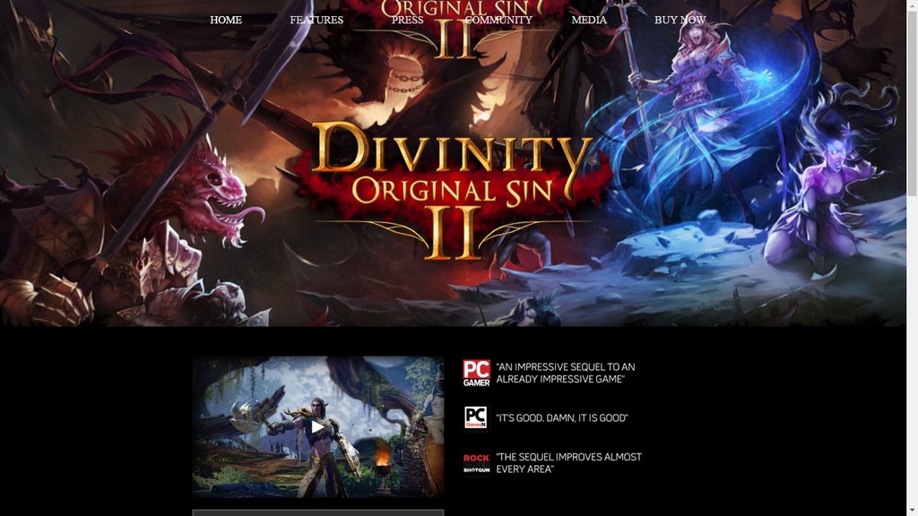
Granted, there is still a decent amount that still needs to be done within the css stylesheet and in plain old html to fill the content and fully realize my vision for any given webpage, but the actual slog of planning, coding, and implementing the vision for a final product was made much, much simpler. The image below is an example, I recreated the home page of a website of an upcoming video game using Semantic UI in only a matter of hours, if asked to do the same using just html and css… I strongly believe I would still be attempting to piece it together a few days later.

One other thing to note, is that I felt I was giving up some amount of ‘easy’ control with Semantic. While everything is easier to implement and certainly less time consuming, I found it hard, to downright impossible, to implement certain ideas given what I know of the framework. One specific example: setting up a menu is a breeze with Semantic, a few words in a class (“ui three item menu”) and the additional set up, and poof just like that a snappy looking menu will appear on your page, however to try to change the font color of the menu items proved an exercise in frustration to me. Though, in time and with more experience, I hope to be able to get around this kind of obstacle as Semantic’s ease of use and even readability is just decades ahead of the html/css combo of old.